Why is it relevant?
It is important that you can deliver a clear message to stakeholders and/or policy-makers in order to affect the changes that your Citizen Observatory suggests. Creating engaging visualisations is one effective way to do that.
How can this be done?
“A picture is worth a thousand words.” This old saying also applies to Citizen Observatories, where data visualisation can help you and your participants to explore and understand data and to communicate results quickly and in an engaging way. Nevertheless, when it comes to extracting meaningful information from data and interpreting the data, scientific knowledge may be required so that the interpretation is accurate and meaningful. Data visualisations, besides communicating results, can also be used as a tool for data interpretation by helping to detect gaps, errors or inconsistencies in your data sets.
Visualisations come in many forms, such as hand-drawn scribbles, complex digital imagery, or multidimensional, interactive applications. It takes both visual and scientific skills to create useful visualisations. Remember, the purpose of visualisations is to tell a story that will affect your audience and encourage them to make the changes that your data is suggesting. The visualisations need to tell the story accurately. At the same time, they need to be interesting enough to hold your audience’s attention. As noted, the visualisation is only part of the story; you will need to interpret the data to place the correct emphasis on the parts of the visualisation that you want to have stand out to the audience. If this expertise is not available among the stakeholders and actors within your Citizen Observatory, you may need to engage experts that can support you with data interpretation and visualisation (more on how to engage key stakeholders here).
However, with some training, every citizen scientist can learn to use data visualisations as a means to interpret and check their own data sets. Here is the reflection from a participant of the WeObserve online course, after finishing a training module on data visualisation:
“After last week’s module, I have been working on the way I visualise my data. In my online blog this week, I have included the new charts I produced because of your course … Because of the visualisation, and how to make the data more meaningful, I discovered some errors in the data records, but also it has identified a weather anomaly, where the last week of June over many successive years has been colder than the weeks either side. I have no explanation for this. Going back into the actual station records, it isn’t incorrect tabulation, there is clearly a trend for this 7-day period to be cooler, over successive years. Curious!“ (Norman Woollons, Learner)
Two very common types of data visualisations are:
- Time-series graphs: These usually show how a variable changes over time. The data on these graphs can be historical from observed and measured data, or future projections based on simulations. Historical time-series graphs can also be based on simulations.
- Maps: These show information and data in relation to a specified system of reference. Two or more variables are plotted against each other. Standard maps combine geological and infrastructure information (such as topography and street maps) with a geographic location; but you can map any information that has a location based on the geographic coordinate system (latitudes and longitudes). There are other ‘maps’ based on different reference systems (like the weekly mood map, or mapping a person’s mental state while performing an activity related to a perceived challenge and the person’s skill level).
Sometimes these two graphs are combined to produce an interactive experience; clicking on the map might display a time-series graph at that location.
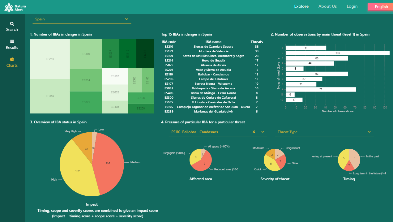
Example from the LandSense project
The Natura Alert app was developed by the LandSense Citizen Observatory to report threats to bird habitats in Important Bird and Biodiversity Areas (IBAs). Using Natura Alert, volunteers in the BirdLife network in Spain have collected threat information, which can be visualised on a map displayed in the Natura Alert web application. The data collected for Spain can also be summarised in a dashboard of charts available in the web app as shown in the figure below. This allows users to see the main habitat threats in Spain as well as by IBA. As more data are collected, these graphs will change dynamically to reflect the current situation.
There are many tools available to map location-based data and visualise it easily. Some cost money, such as Tableau, PowerBI and Spotfire; others are free, such as Grafana, Rawgraphs and Apache Superset. With these, you can quickly produce a map like this one and also quickly see if sensors are out of place (i.e., in the ocean). Sharing a graph like this with participants can encourage them, as they can see the progress of the project.
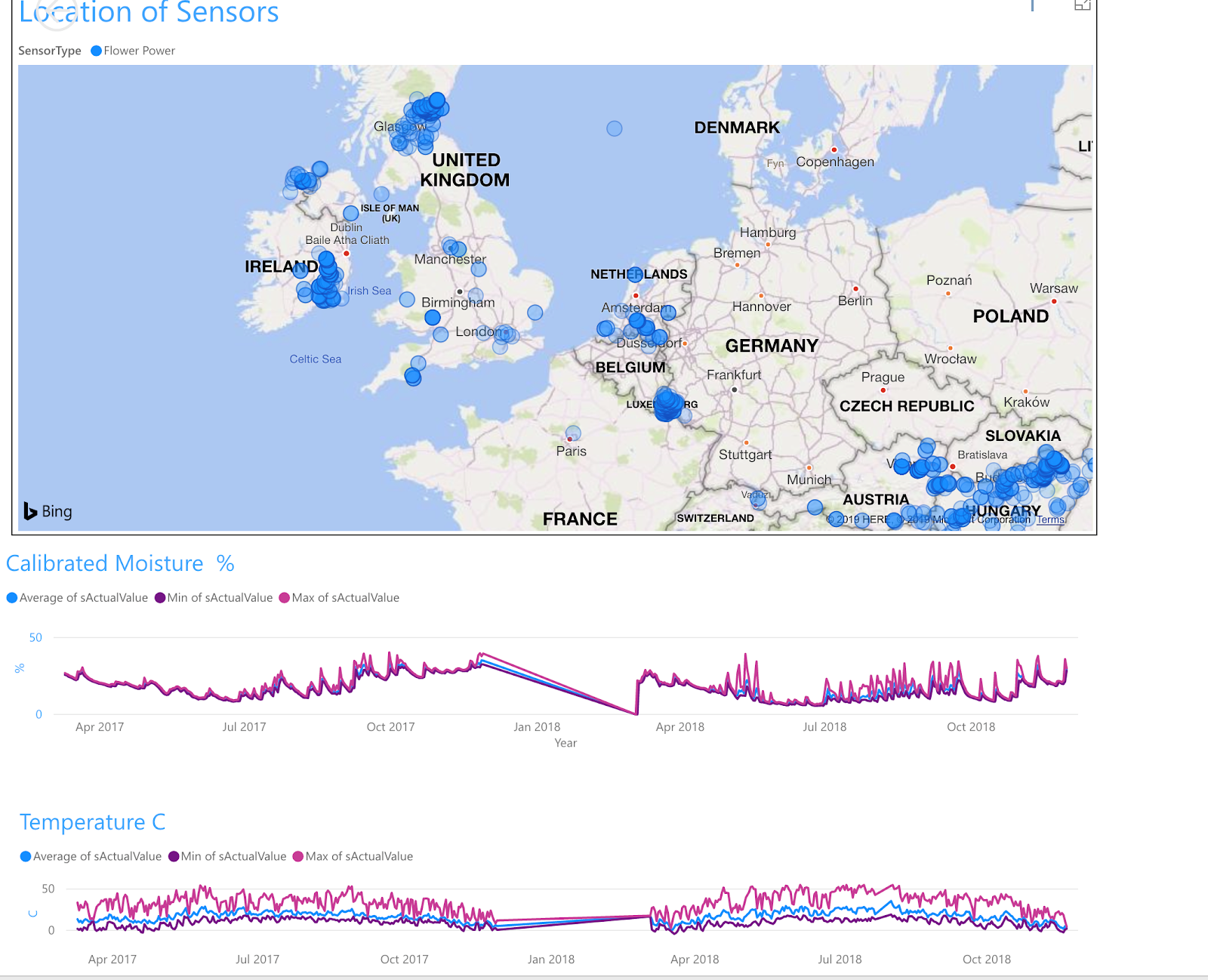
Image: The GROW Observatory map of soil sensors across Europe.
This visualisation shows the location of GROW sensors and the data from one sensor. However, it shows the importance of interpreting the data and the need for relevant scientific experience. For instance, on the temperature and moisture graphs there are straight lines – what can these mean? In this case, it means that data is missing because the battery died on the sensor. Also notice the patterns in the moisture levels – what do these indicate? Someone with the necessary scientific expertise could interpret these graphs and, more importantly, compare them with graphs from other locations to draw conclusions on soil moisture.
The Data Postcard Tool is a creative way to visualise and share data from a citizen science project. It is designed for community members and citizen science practitioners who wish to share the data they collect. It can be used to illustrate something simple, like the amount of times you walk through an area with high air pollution over the course of a week, or the kinds of animals you have observed in a prescribed area. This tool is designed for participants in a citizen science project, and no previous experience of data visualisation is required.
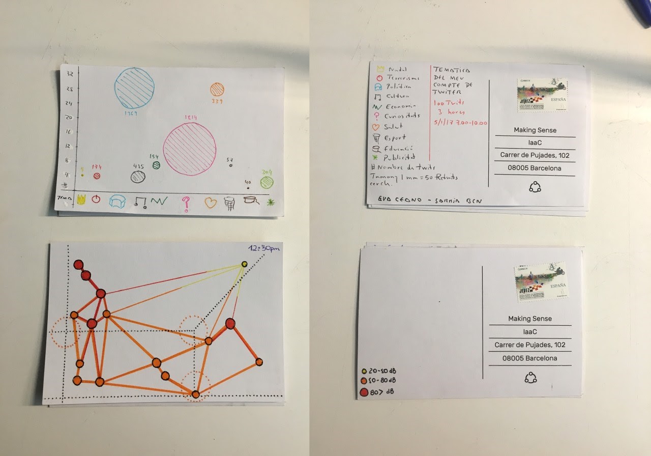
Image: Data postcards from Making Sense project
Useful Resources
WeObserve MOOC, enrollment is now open: The online course Citizen Science Projects: How to make a difference on FutureLearn addresses data analysis and visualisation in depth, including many examples, discussion of biases in data visualisation, and data sets for you to experiment with.
VIDEO: “How we did it: Visualising Data” provides more examples of data visualisations from four Citizen Observatory projects.
TOOL: WeObserve Toolkit for data quality and visualisation is a selection of tools that can help you with all aspects of citizen-generated data management, including validation, analysis, quality assurance and visualisation.
TOOL: The Data Postcard tool is designed for community members and citizen science practitioners wanting to share the data they collect. It is a creative way to visualise and share data from a citizen science project.
Data visualisation applications:
- Matplotlib: For those of you with programming experience, Matplotlib is a popular choice for data visualisation and can be easily integrated into Jupyter notebooks.
- Leaflet: Leaflet is an open-source JavaScript library for mobile-friendly interactive maps. It works efficiently across all major desktop and mobile platforms, can be extended with a variety of plugins, and is well documented.
- Other free tools: Grafana, Rawgraphs, and Apache Superset
You may also be interested in:
I want to generate insights & results from our data & knowledge…
I want to achieve impact with Citizen Observatory results…
…by communicating the Citizen Observatory results effectively
This work by parties of the WeObserve consortium is licensed under a Creative Commons Attribution-ShareAlike 4.0 International License. ![]()
This page partially draws upon the MOOC Citizen Science Projects: How to make a difference, though the focus was shifted from citizen science projects to Citizen Observatories.